How Important Are Visuals to Effective Branding?

There has been a move in recent years to expand the scope and meaning of ‘brand’ in the business world. So much so that some marketing experts define brand as the one thing that distinguishes a company from all others. Such a broad definition is understandable when you consider the competitive nature of the modern business environment. Still, companies and their marketing teams should not ignore the fundamentals – like visuals.
Modern marketers bristle at the thought of a brand being little more than a logo, graphics, and an appealing color scheme. They correctly assert that brand is about more than visual engagement. But let us not throw the baby out with the bathwater. Consumers do not always grasp the intangible aspects of their favorite brands. They do recognize logos and color schemes.
A Favorite Cookie
I have a favorite cookie with a very recognizable name and logo. It is a sandwich cookie, and the logo is actually baked into both sides of the sandwich. When I think of that particular brand, I don’t think about what sets the company apart from the competition. I think about the taste of their cookies.
Seeing the logo makes me want to sit down with a cold glass of milk and an unopened bag all to myself. I can almost taste
You would recognize the Nike swoosh anywhere. Likewise for Target’s red target logo. Say what you want about branding being that one thing that sets a company apart, but people remember what they see before they remember what a particular brand means to them in terms of quality, customer service, etc.
2. Color Scheme
Color schemes are as important as logos. Both the Nike and Target logos offer color schemes that are both easy to look at and aligned with the image the companies are trying to project. But it is not just the big boys. Consider Umai, a boutique clothing brand that designs and sells anime clothing and accessories. Their logo utilizes a simple black-and-white color scheme that is as recognizable as Nike’s.
3. Font Choices
Whether you call it typography or font choices, the net effect is the same. The readability of a brand’s text contributes to messaging success. Equally important is whether the font choice aligns with the brand’s image. For example, it wouldn’t make sense for a French restaurant to choose New Times Roman for its typography.
4. Image Choices
Above and beyond creating a logo, brands utilize images to convey messages. We are talking illustrations, photographs, vector graphics, and even videos. All play into the visual connection customers make with those brands. If image choices do not align with the rest of the visuals, they will not do anything to enhance branding. They may even detract.
It is true that branding isn’t exclusively about visuals. Yet even as we have expanded the meaning of the term, it’s a mistake to neglect the visual aspect as though it is not as important as it once was. Nothing could be further from the truth. Human beings are visual. Therefore, successful branding requires putting a substantial amount of effort into the visuals – so that customers draw the right associations.
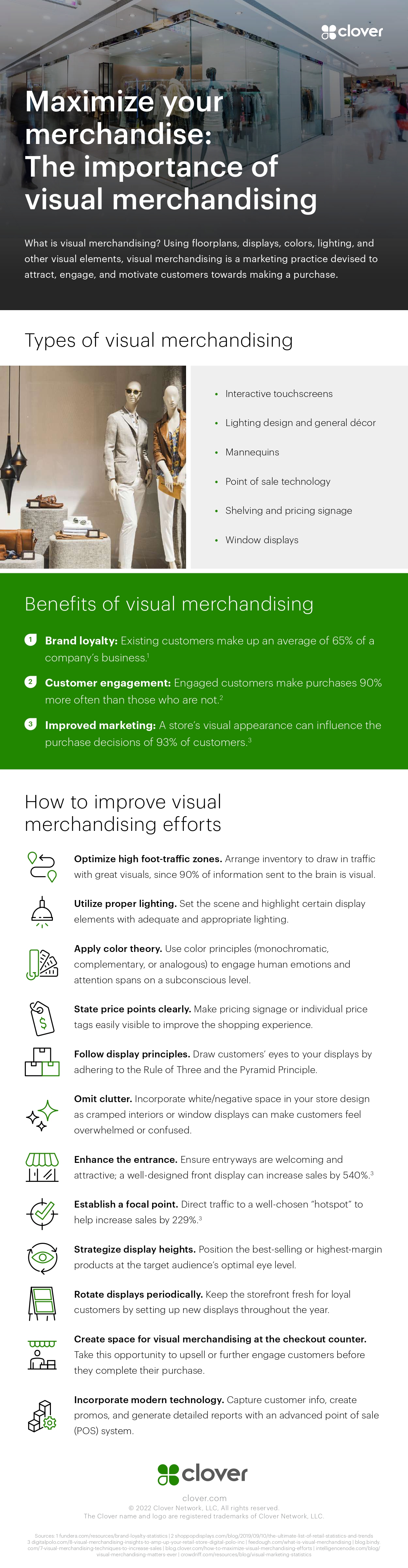
Infographic created by Clover, a retail POS system company